Identities that Speak
Finding the edge
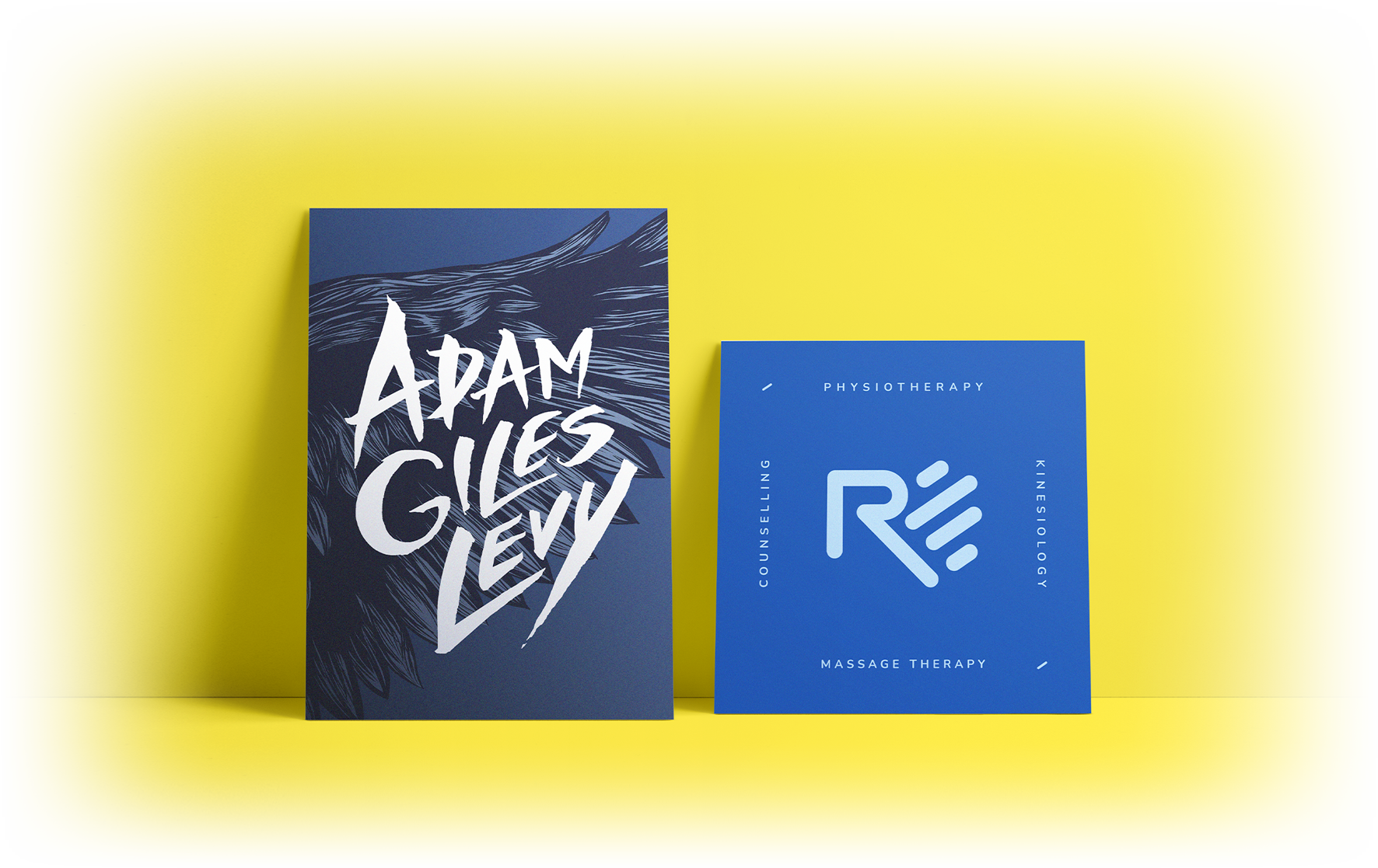
Two identity systems shaped by different stories and constraints, each designed to find its edge.


Two identity systems shaped by different stories and constraints, each designed to find its edge.

Every identity begins with discovery, uncovering the values and tensions that define what a brand stands for.
Those insights guide concept exploration, where ideas are tested and refined before being shaped into a cohesive system. The identity is then documented and rolled out with intention, ensuring it remains consistent, scalable, and true over time.
The case studies that follow show this process in action, applied to two very different brands.
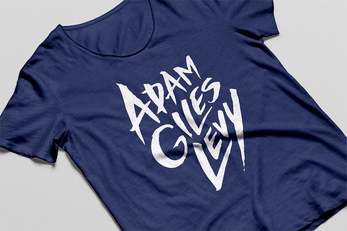
A musician’s identity built to carry emotion and remain unmistakably his wherever the music travels.
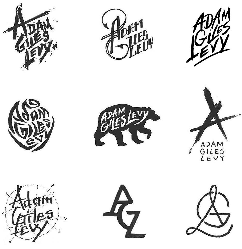

Discovery sessions with Adam surfaced themes of symbolism, storytelling, and recognition beyond language, which shaped a wide series of concept sketches for the identity.
Drawing from nature, animal imagery, and mythic influences, the explorations tested expressive typography and emblematic forms to find a visual signature that could travel across stages, merchandise, and formats worldwide.

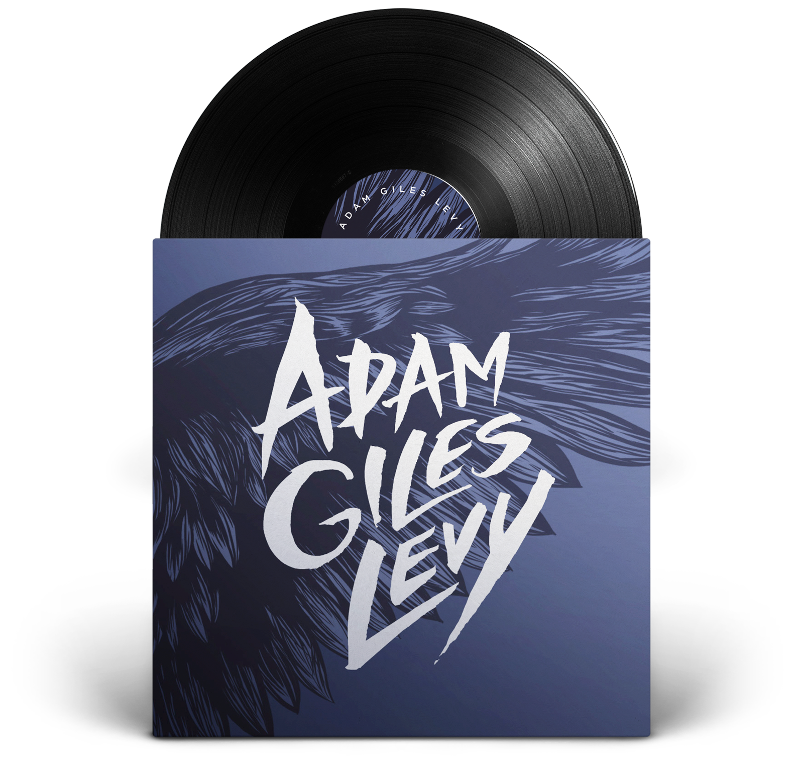
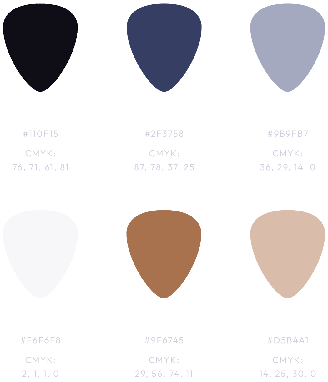
The identity centred on a stylised signature of Adam’s full name, paired with a bird-wing illustration inspired by nature, mythology, and movement. A supporting, earthy colour palette added depth and flexibility to the system.
The identity was applied across albums, merchandise, tour and festival materials, and live performance, evolving alongside Adam’s music while remaining a consistent visual anchor throughout his career.



A values-led identity designed to balance clinical credibility with warmth, and scale without losing its human core.


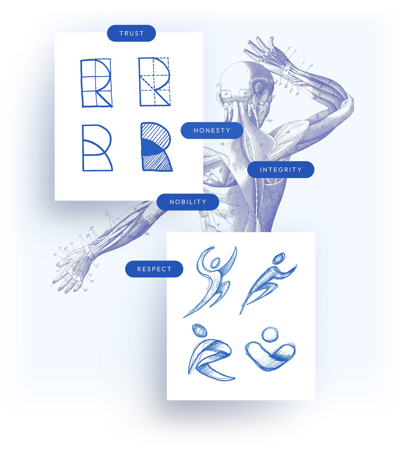
The process began with a discovery session focused on meaning, not aesthetics, defining what Revere Physio should stand for: trust, integrity, respect, and quiet confidence.
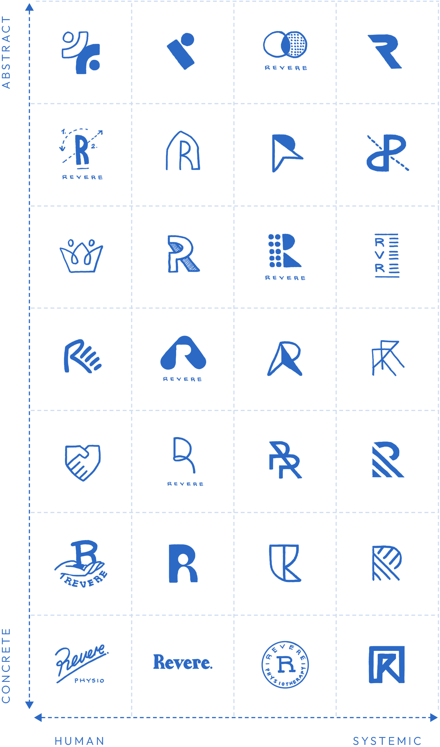
These themes informed a wide range of identity explorations, from literal interpretations of the letter “R” to more abstract ideas rooted in motion, balance, and transparency.
Early concepts were mapped across a human–systemic and concrete–abstract framework, guiding discussion toward a mark that felt both credible and human.



At its core, the Revere identity is about trust in motion.
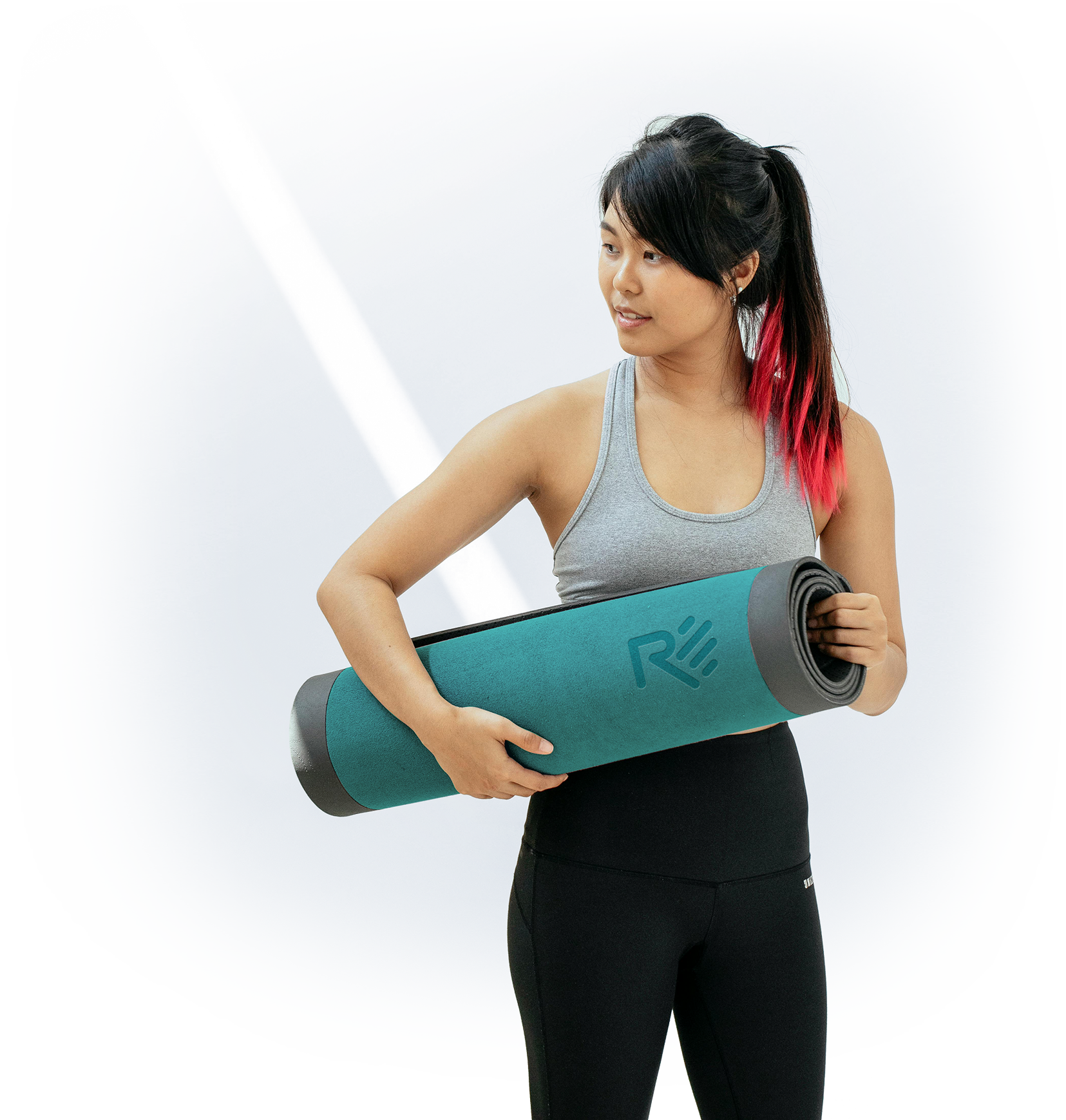
Built from the “R” in Revere, the mark uses diagonal forms to express movement, progress, and forward momentum, essential qualities in recovery.
Subtly embedded within the form is the shape of an outstretched hand, a quiet symbol of trust, respect, and human connection.

Once the identity was defined, it was systematized.
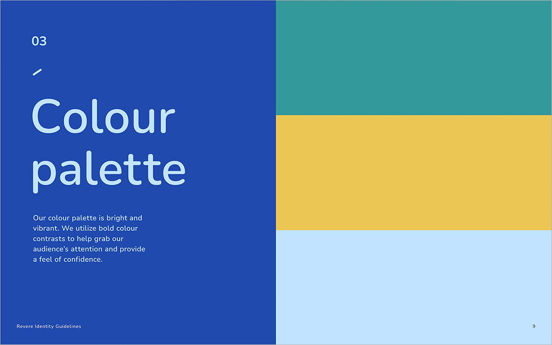
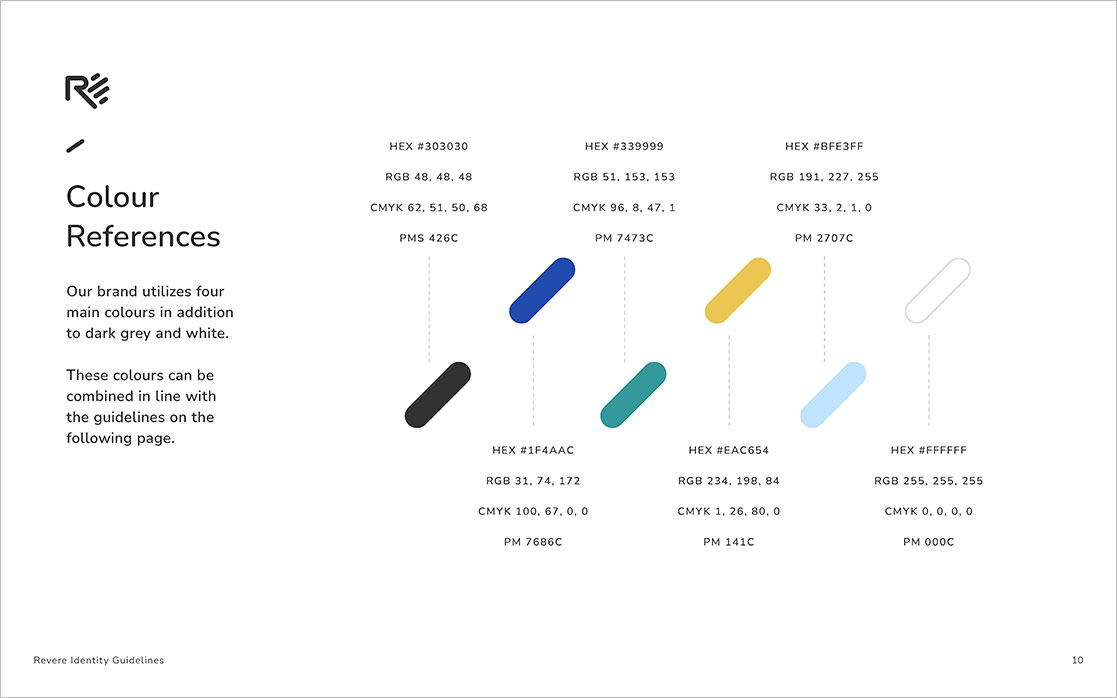
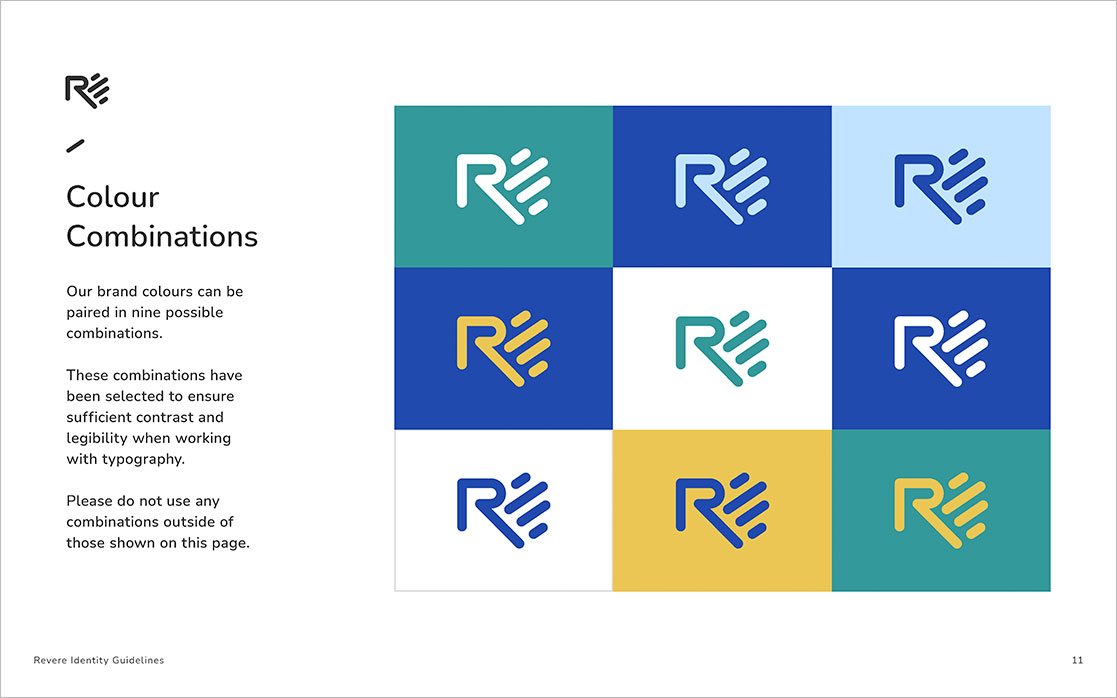
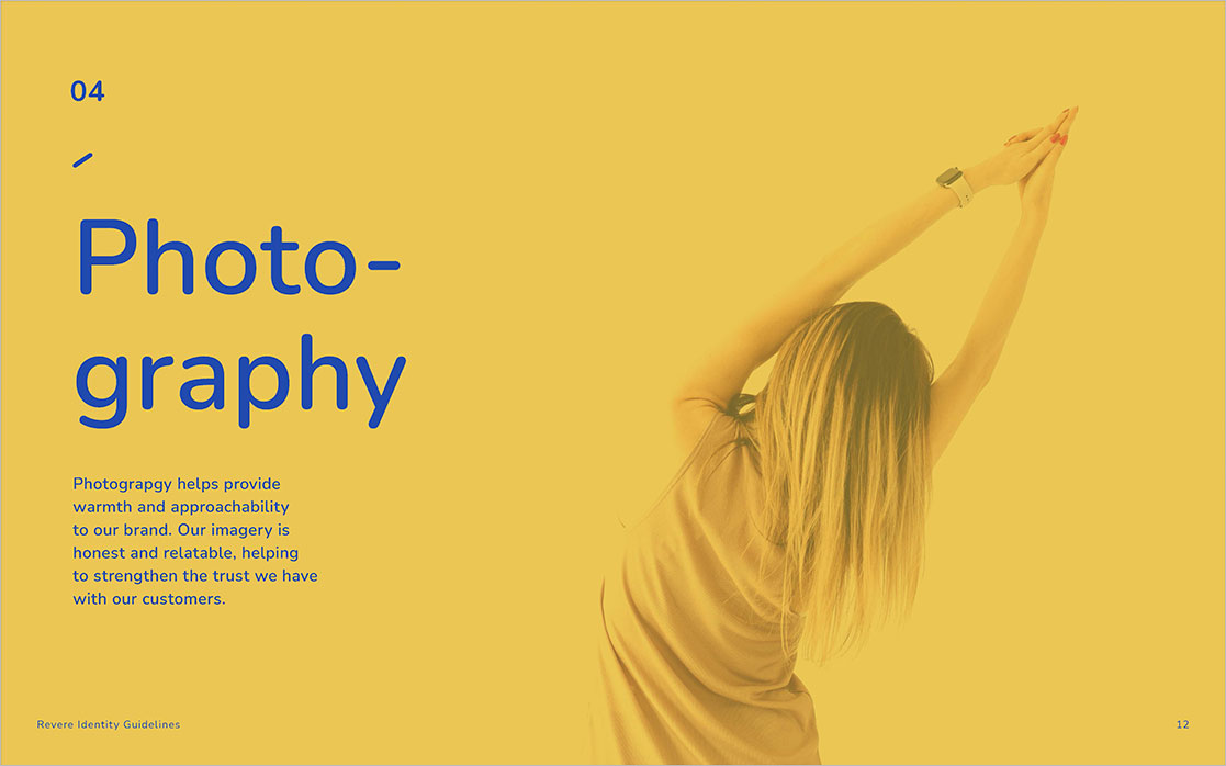
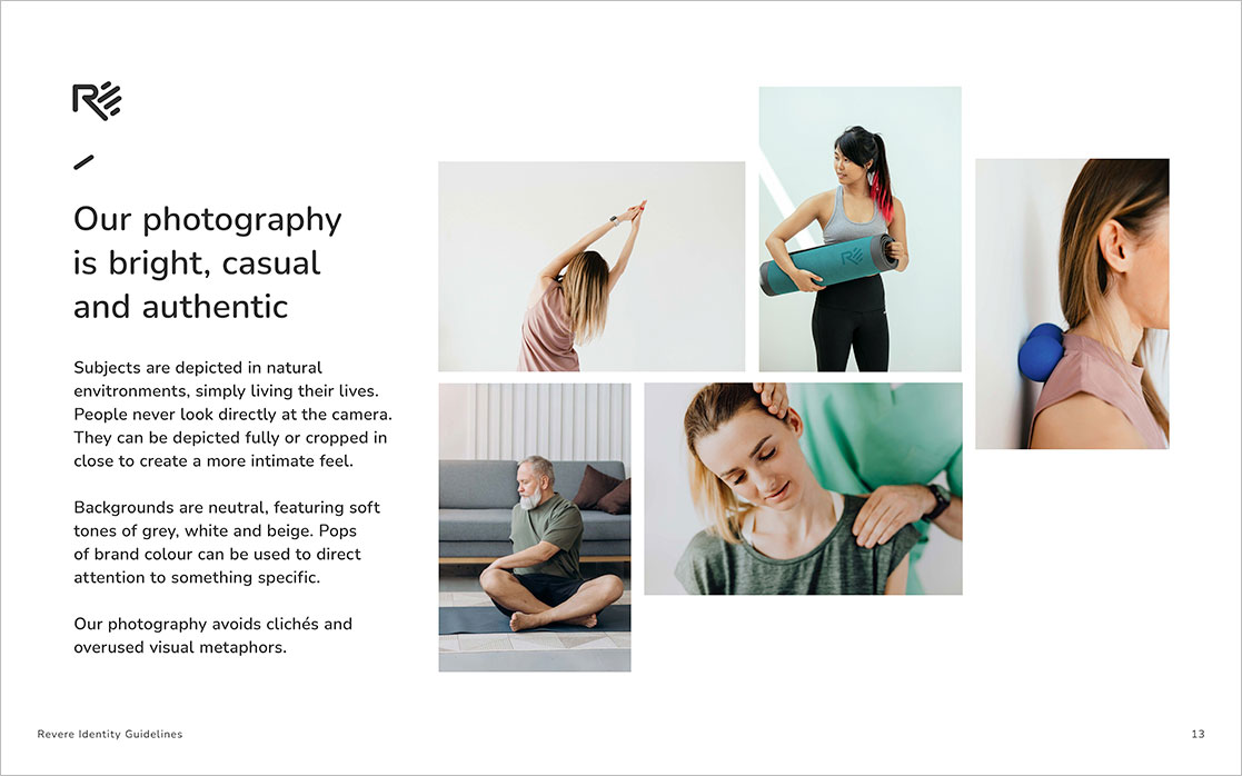
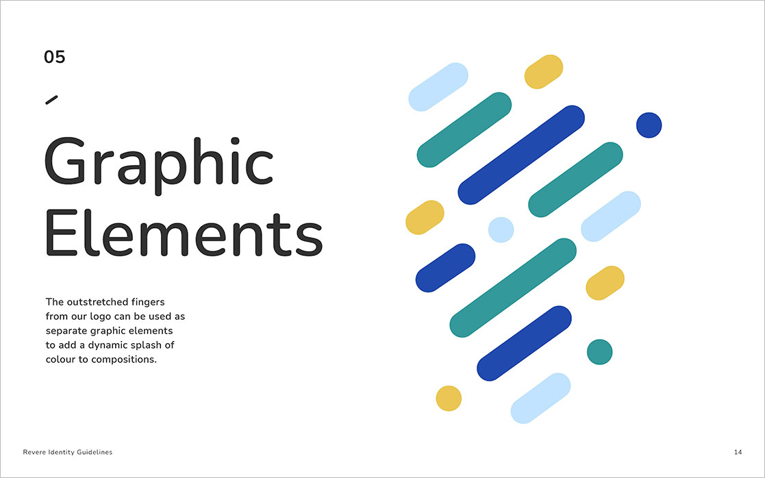
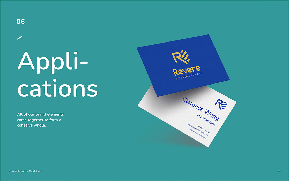
A comprehensive set of brand guidelines were created to ensure consistency across every touchpoint, from logo usage and colour, to typography, photography, and graphic elements.
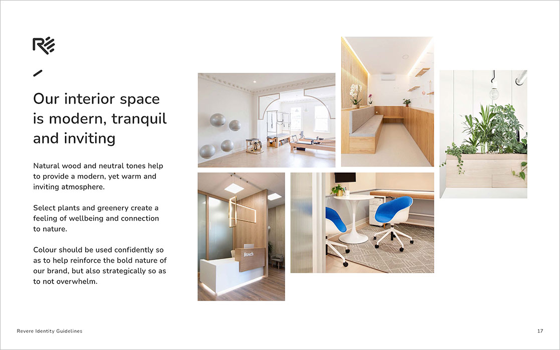
The system was rolled out across digital, print, and physical spaces, supporting Revere’s growth across multiple Vancouver locations.



These projects may look different on the surface, but they’re built the same way underneath.
Identity starts with meaning, takes shape through systems, and earns its value through consistency over time. Whether personal or commercial, the goal is the same: brands that know who they are and carry that clarity wherever they go.